Firefox 29 (Australis)
- Inicie sesión o regístrese para enviar comentarios
What do you think about the new Australis user interface?
I don't like it. The new Tabs need far more space and customisation is limited to the navigation bar. Even the "TabsOnTop" option in about:config doensn't work any more. If you want to have the old theme back, you have to install this add-on: https://addons.mozilla.org/en-US/firefox/addon/classicthemerestorer
https://support.mozilla.org/en-US/kb/put-tabs-back-on-bottom
I hope that Abrowser will never get Australis.
The add-on is licensed under the Mozilla Public License https://www.mozilla.org/MPL/2.0/ - The source is here https://addons.mozilla.org/en-US/firefox/files/browse/252774/ (I'm not sure if it is Free Software)
Maybe, this add-on can be integrated into Abrowser if there's no other way then using the default Firefox 29 for Abrowser. This add-on can also be used if you like Australis but you want to have more customisation.
The Mozilla Public License is a free software license: https://www.gnu.org/licenses/license-list.html#MPL-2.0
Just my 2 cents but why don't you have the Australis era of Abrowser named Bbrowser (or Tbrowser), while keeping Abrowser in the repository for those who don't want Australis?
Because that would leave ABrowser unmaintained, and thus open to security and compatibility problems.
Australis is terrible, of course... so why not have CTR included by default as part of Trisquel? Trisquel is already noted for having a "non-default" GNOME layout when first installed, so why not have a "non-default" browser UI as well?
And, if a user doesn't like the way the "new" ABrowser UI looks, CTR will allow them to customise it right away, without needing to install the add-on themselves.
I don't get what's so bad about this new interface. I think it's an improvement. I really like the new icon-based menu, the new bookmarks toolbar means I finally don't need the classic menu bar anymore, and not having to use the old add-on bar saves vertical space (some icons for add-ons were locked to the right of the add-on bar previously; now, they can be moved around like the rest of them).
I agree with you. Although the previous interface was pretty good and even if I was accustomed to it, I like the new one, that is quite an improvement. Moreover, a new and revamped design, a smoother interface has the advantage to convince potential new users, that Firefox/Abrowser has nothing less than, for instance, Chrome (they were yet equally fast, but what about those good-looking tabs of Chrome's), even if being proprietary software is a sufficient reason not to use it...
Agreed. I too find the new interface to be an improvement. I particularly like having the old addon bar removed. I constantly get support calls from users that have closed the addon bar and can't remember how to get it back. The design was horribly broken.
Having said that there are some extensions that do not play well with the new design (like quickproxy). But that's not an issue that a simple update to the extension cannot resolve.
Well, some people find it too Chrome-esque. And as fine with it as I am (I'm using it right now) perhaps a less Chrome-esque tab bar will do it wonders.
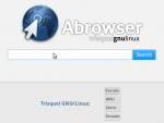
I like the new homepage: attached.

Please add https://addons.mozilla.org/en-US/firefox/addon/classicthemerestorer to https://trisquel.info/en/browser/addons. Instead of restoring the old look completely, it gives you the option to customize every part of Abrowser. You can use old, new and alternative elements and combine them. This way you can make Abrowser look like you like it best. So everyone who loves the new design but wants to have the star to add bookmarks in the locationbar or the tab bar below the navigation bar can do it with this addon. Maybe you just want to save some space and add the firefox button to the navigation bar instead of using the menu bar.
I don't really have an problems with the new interface, it's quite usable. I didn't really see much wrong with the old interface either though. Not enough to warrant a redesign that didn't enhance the experience in any major way.
I suppose a lot of people guenuinely don't like the new interface but I would argue that many people just complain because that's what everyone else is doing.
- Inicie sesión o regístrese para enviar comentarios

